PROJECT OVERVIEW: REIMAGINING THE RECKITT INTRANET

Project overview
Reimagining The Reckitt Intranet
This was a solo design project where I partnered with Reckitt, a global consumer goods company known for brands like Dettol, Durex, Lysol, and Harpic to redesign their internal intranet system. Over the years, Reckitt’s intranet had evolved organically, with no design oversight. It grew like a thorny tree tangled, expansive, and difficult to navigate. What began as a simple internal tool had become a massive and cumbersome system that employees struggled to use. The decision was finally made to rethink the platform from the ground up.
The biggest challenge was approaching this with care: the intranet, as flawed as it was, had been built and maintained with a lot of internal effort, it was their baby. I had to identify and address its shortcomings without dismissing the work that had gone into it.
Another key challenge was time. Like most fixed-budget projects, timelines were tight. This meant we couldn’t afford to conduct textbook user research. Instead, I relied heavily on stakeholder knowledge, primarily from managerial roles who understood broad use cases but needed to loop in others for more specific workflows. This often led to delays, but I adapted by working iteratively, gathering pieces of the puzzle as they surfaced, and shaping the system progressively.
This project was a deep dive into design diplomacy, lean research, and the art of untangling complexity under constraints.
Research
Understanding the Intranet
Persona Development
To understand the users and their needs, we began by engaging directly with stakeholders, who not only manage the tool’s end users but also use it themselves. Through a focused workshop session, I facilitated conversations to uncover key pain points, goals, and behaviors. These insights were enriched through one-on-one discussions, allowing me to observe their workflow, gather context, and identify what matters most to them.
This collaborative process helped shape clear, realistic personas that reflected the users’ roles, motivations, and challenges, forming the foundation for all design decisions moving forward.
Daily Activities
-
To plan the promotions according to the LSMs.
-
To procure the requested quantity of products without any curtailment.
-
Standardisation of the P&L submission and P&L requests processes.
-
Access daily sales for P&L management.
-
Viewing displays, product details and specs.
-
Accessing full year sales report.
-
Forecasting for displays.
-
Ordering product samples for retailer meetings.
Frustrations
-
Product images are not comprehensive and up-to-date.
-
Lacks a dynamic order tracking system and fulfilment.
-
Chances of human error due to heavy email dependency and manual input.


Research
User journey Mapping
To design an experience that truly supports users in their daily tasks, we identified and mapped the major user journeys across multiple collaborative sessions. We focused on three primary personas for the initial phase, each representing a key user group whose work was deeply tied to the intranet.
For these users, the intranet was more than just a tool, it was their single source of truth and the centralized repository for everything from documents, images, and product information to marketing calendars and internal updates. Understanding their dependency on timely, accurate, and easily accessible information helped us define journey maps that highlighted their goals, pain points, and key touchpoints across the platform.
These journey maps not only helped us prioritize features and structure the content logically, but also ensured the experience was aligned with how users actually worked, efficient, intuitive, and reliable.

Research
Feature List & User Flows
After defining our key personas and mapping their user journeys, we conducted a prioritization exercise to identify the most critical user flows and features for the intranet. During this phase, we collaborated with the larger stakeholder group, collecting input and conducting a voting process to align on what mattered most for launch.
This exercise helped us uncover both essential user flows and several “dream features” that stakeholders envisioned for the platform. Based on collective input and project goals, we finalized a set of P1 (Priority 1) flows and features for Phase 1 of the project. These included core tasks like accessing documents, retrieving product information, managing marketing calendars, and more.
Features and flows that were deprioritized for Phase 1 were not discarded, they were thoroughly documented and organized for review during Phase 2 discussions, ensuring a clear and continuous roadmap for future enhancements.
Key Features
1. Intuitive navigation
2. Advance search and filter
3. Version control
4. Role based access
5. Widget based Launchpad
6. Repository
7. Actionable Notification
8. Advance Communicator
9. Inventory Indicator
10. System-triggered messages
11. Live order tracking
12. New cart experience
13. Ticket system
All Flows
1.
2.
3.
4.
5.
6.
7.
8.
9.
10.
11.
12.
13.
14.
15.
16.
17.
18.
19.
To download the reports and documents to plan the promo calendar.
Forecasting for SPT for a customer
Ordering sales samples for a sales meeting.
Tracking shipment of the of all products orders.
Taking action or accessing a page from the notification panel.
Templates (e.g - P&L) and links (e.g - FSI, Mediagrids etc) used day to day.
Searching for a product or a document, spec sheets, MSDS and presentation.
Access customer-specific product listing and sales report.
Access listing for discontinued products.
Requesting for corrections in the product specs or images
P&L management using daily sales (Power BI?)
Tracking ticket progress.
Following up on a raised ticket by mentioned a comment in the my ticket section ?
Changing the notification preferences and other settings.
Accessing help documents, calling customer care helpline.
Signing out of the sales intranet.
Viewing order and ticket related update messages.
Customising widgets on the launchpad for your team/yourself.
Following up on an order by mentioned a comment in the my ticket section.
Accessing product images, spec sheets, MSDS and presentation from the repository.

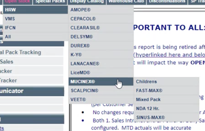
Structuring the Intranet
Information Architecture
To redesign the intranet into a user-first, intuitive experience, we explored three structural approaches before narrowing down to a hybrid of two: role-based and task-based navigation. The primary goal was to ensure users could access the information they need in as few steps as possible. Through workshops and co-creation sessions with stakeholders, we learned that employees were deeply frustrated by the legacy intranet’s arbitrary structure and buried documents. To address this, we logically grouped documents and tools under intuitive categories (e.g., “Benefits,” “Projects,” “Onboarding”) that aligned with how people actually think and work.
One of the most impactful additions was the customizable quick links feature. Users can now personalize their homepage by pinning shortcuts to frequently used tools or pages, based on their role and tasks. This small change had a big impact on efficiency and user satisfaction. By grounding the architecture in real user needs, and enabling both structured access and personal flexibility, the new intranet dramatically reduces friction and makes day-to-day tasks easier to complete.

UX Evaluation of the existing intranet
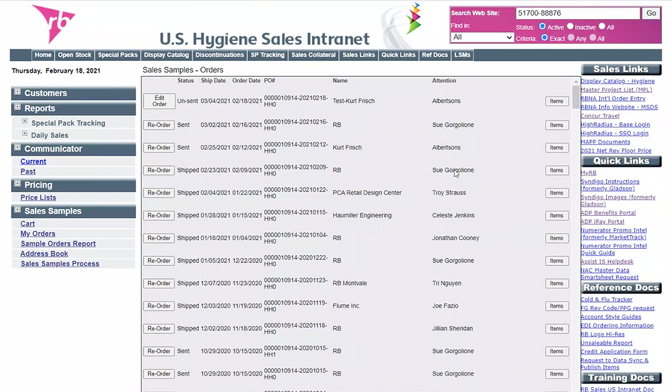


1. Cognitive Overload & Clutter
The screens are text-heavy with minimal visual hierarchy. Users have to work hard to find relevant information. Everything competes for attention.
2. Poor Information Architecture
Navigation is dense and overwhelming (e.g., too many categories in the sidebar and links scattered on the right). Users may feel lost or unsure where to begin. Redundancy in link categories (e.g., “Quick Links,” “Reference Docs,” “Training Docs”) adds confusion.
3. Ineffective Search & Filters
The search area is small and generic (e.g., “Search Web Site”) with unclear criteria and status filters. Users are not sure what they’re searching in (site? product database? MSDS files?) or how filters work.
4. Navigation Is Rigid and Deep
Vertical sidebar and top nav bar offer parallel, sometimes overlapping pathways. Users might need to hunt across menus to complete a single task.
5. Outdated Visual Design
The UI looks dated, early 2000s HTML table style, low visual contrast, small fonts. Hard to read, not mobile-friendly, and uninviting.
6. Lack of User Context
No personalization or role-based dashboards. Same interface regardless of user goals. Users are not guided toward their most relevant tools or info.
7. Poor Affordance for Actions
Key actions like “Add to Cart,” “Clear Cart,” “Next,” or “Remove Item” are small, inconsistent, and not visually prominent. Slows down frequent tasks, leads to frustration or errors.
8. Redundant or Jargon-Heavy Labels
Terms like “RB FGF,” “GIC,” “US-NK7” appear with no explanation. Only seasoned users might understand them, excluding newer employees or external partners.
Based on the primary research and a thorough evaluation of the existing intranet, I developed a foundational design framework that guided the entire redesign process. This framework was grounded in a deep understanding of user pain points, usage patterns, and organizational needs, gathered through stakeholder interviews and firsthand observations. It acted as a lens through which I evaluated every design decision, helping balance business priorities, user needs, and technical constraints.

First Draft of Wireframes
Given the organically grown and unstructured nature of the previous intranet, the framework focused on a few core principles: information clarity, task-based navigation, progressive disclosure of complexity, and visual consistency. These core principles became the backbone of the wireframing process, informing every layout, interaction, and design decision that followed.

Visual Design
The visual design of the new intranet was guided by both functionality and brand alignment. Given the content-heavy nature of the platform, clarity and legibility were top priorities. To achieve this, I developed a dedicated design library rooted in Reckitt’s brand guidelines, ensuring consistency across the entire system while enhancing usability.
The visual language was intentionally minimal. I chose to use a restrained color palette, dominated by white and soft neutrals, to create breathing room around dense information and avoid visual fatigue during extended use. This allowed the content, documents, dashboards, and task flows, to take center stage.
Reckitt’s signature pink was strategically used as an accent color, highlighting buttons, active states, alerts, and key navigational elements. This not only reinforced brand identity but also improved wayfinding and visual hierarchy without overwhelming the user.

The design library includes:
-
Standardized typography scales for headings, body text, and labels
-
A consistent icon set for intuitive navigation
-
Button styles, form elements, and UI components optimized for accessibility
-
A responsive grid system adaptable to various screen sizes and devices


Interactive Mockup
Please click below to see a short mockup of the intranet.


© 2026 by Ashlesh Londhe. All Rights reserved