
Project Overview
Revamping Vendor Management Portal
Delivery Hero SE is one of the world’s leading online food delivery and quick commerce platforms, headquartered in Berlin, Germany. Operating in over 70 countries, Delivery Hero connects millions of customers with local restaurants, groceries, and essential services through its network of global brands. The Berlin headquarters where I was working, serves as the company’s global innovation hub, home to diverse teams working across product, design, and technology to shape seamless digital experiences at scale.
During my time at Delivery Hero SE in Berlin, I worked as the sole designer on the Vendor Management Portal, a large-scale internal platform used across all Delivery Hero brands and countries to manage vendor data. The system served as a backbone for operations, housing critical information such as vendor profiles, global settings, IDs, contact details, and a wide range of predefined attributes.
Our cross-functional team included one project manager, ten developers, and me as the designer. Together, we focused on creating a user experience that could handle complex data structures while remaining intuitive and efficient for daily use.
Understanding the Portal
To gain a deep understanding of how the Vendor Management Portal was being used across different regions, I created a structured research plan. The research involved scheduling interviews with users from the MENA, LATAM, and EU regions, ensuring a diverse set of perspectives from teams that interact with the system daily. Alongside this, I prepared a detailed questionnaire sheet to guide the conversations and maintain consistency across sessions.
To quickly validate the team’s early thinking, I also developed concept wireframes, which were shared during the interviews to gather immediate feedback on usability, structure, and intuitiveness.
We conducted multiple sessions with frequent users of the portal. The objective of this discovery phase was to understand:
-
How the Vendor Management tool is currently used
-
Which information is most frequently accessed and most valuable to users
-
What challenges users face when working with Vendor Management in relation to other VBO plugins
-
How early design concepts aligned with user needs and workflows
*VBO - Vendor Back Office
Interview Zoom screen shots
Interview Zoom screen shots


Details of interviews
Platforms used: Zoom and Google Meet.
Session length: ~30–45 minutes per session.
Participants: frequent users of VBO plugins (especially the Vendor Management plugin).
Participants by region (actual interviews): 5 users from APAC and 3 users from EU.
Purpose: validate early concepts, surface common pain points, and identify data and workflow patterns that matter most to users.
The insights gathered from these sessions informed the design decisions and helped prioritise features and flows, particularly around how users access vendor metadata, navigate between plugins, and interpret the many predefined attributes and IDs present in the portal.
This was a combined research for POS Landing Page and Vendor Management project
🔍 Key Early Insights from Discovery
-
Users primarily visit Vendor Management to look up vendor data, not to edit it frequently.
-
There is high dependency on vendor metadata (IDs, hierarchy, attributes, status).
-
Users often switch between multiple VBO plugins after finding vendor information, leading to workflow friction.
-
Lack of a consolidated vendor overview makes it difficult to understand vendor relationships, linked attributes, and system status at a glance.
-
Users rely on manual workarounds and external notes to compare vendors or track updates.
-
Early concept wireframes were well-received, validating the direction of making vendor data more discoverable and actionable.
Analysing the Status Quo of the System
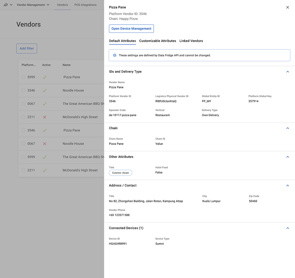
Overlay Drawer
The current design uses an overlay side drawer to display vendor details and attributes, which is one of the most critical functions in the Vendor Management Portal. This drawer is not just a convenience panel for quick checks; it is where users interact with the primary data model of the system.
However, by presenting this core content inside a narrow side drawer, the interface unintentionally suggests that it is secondary or less important than the vendor list behind it. In reality, it should hold the highest level of focus.
Why this is a problem
-
UI importance conflict — The vendor table remains visible, competing visually with the detailed vendor attributes panel, which should be the main focus.
-
Reduced clarity & cognitive load — The constrained drawer width forces dense text, tighter grouping, and additional scrolling, making the high-volume metadata harder to digest.
-
False affordance — A drawer conventionally communicates quick actions / preview. But here, it’s being used as a primary workspace, creating a mismatch between UX pattern and actual use case.

Visual Layering & Interaction Clutter
Currently, when certain actions or confirmations open (e.g., device management or confirmation dialogs), the result is three stacked UI layers:
Main screen → Drawer → Modal
This produces visual and cognitive stacking, leading to:
Confusion about what layer the user is operating on
-
Loss of focus
-
Risk of accidental interaction
-
A “trapped” feeling when modals appear inside a drawer
Not only is this unconventional, it can feel unstable and overwhelming.

RlBfU0ctanhtaQ
Inconsistency in UI
The existing interface uses outdated visual patterns that no longer align with the design language of the other applications users work with simultaneously. This inconsistency forces users to constantly switch mental models, remembering different layouts, interactions, and visual cues for each interface.
As a result, even simple tasks feel harder, navigation becomes unintuitive, and the overall user experience suffers from unnecessary cognitive load
Observations
The current design has grown organically, and as team members noted, it has reached a point where adding new data sets feels difficult and forced. The drawer layout is:
-
Not scalable for more attributes or new modules
-
Hard to restructure as taxonomy grows
-
Physically constrained by screen geometry
-
Increasingly inconsistent as new sections are appended
A full-page, modular layout would support future growth and accommodate richer metadata, visual indicators, and secondary navigation without crowding.
Vendor Ecosystem
During the discovery phase, it became clear that one of the biggest operational inefficiencies came from the number of separate applications the vendor team needed to use. On average, a single workflow required switching between 4–5 different systems, each responsible for a different part of the vendor lifecycle. While these applications were technically connected to Vendor Management, they were still completely separate interfaces.
Design Goals & Opportunities
Based on the research findings and problem definition, the design approach focused on improving usability, workflow efficiency, and system clarity while supporting future scalability. The redesign aimed to shift the portal from a data-heavy interface to an insightful and action-oriented product.

-
Introduce a Vendor Overview Dashboard for quick insights
-
Surface contextual actions connected to other VBO plugins
-
Use progressive disclosure to manage complexity without hiding depth
-
Provide attribute grouping and definitions for clarity
-
Improve role-based visibility and system feedback
-
Visualize system status and dependencies across plugins
Opportunity Areas
Redesigning Structure
Shown below is the redesigned structure used across the entire application. Establishing this clear, consistent framework made the interface more organized, easier to navigate, and significantly more scalable as new features, markets, and variations were added.


Design Approach

Clear top-right cluster for main actions: Assign Device, Convert to POS, and more menu. Back button restores orientation.
Clean left-side navigation (Default Attributes, Customisable Attributes, Linked Vendors, etc.) allows users to reveal information section-by-section.
Critical metadata surfaced as visual tags at the top (New vendor, Active, Restaurant, Non-POS Vendor, Platform, Region selector).
Two clean content columns, grouping by category (IDs, Chain, Other Attributes, Address). Clear titles, stronger visual hierarchy, whitespace.
Full-page modular layout with sidebar navigation and wide space for dense data, scalable for adding new attributes, modules, regions, or widgets.
Interactive Mockup
Please click below to see a short mockup of Vendor Management.


© 2026 by Ashlesh Londhe. All Rights reserved